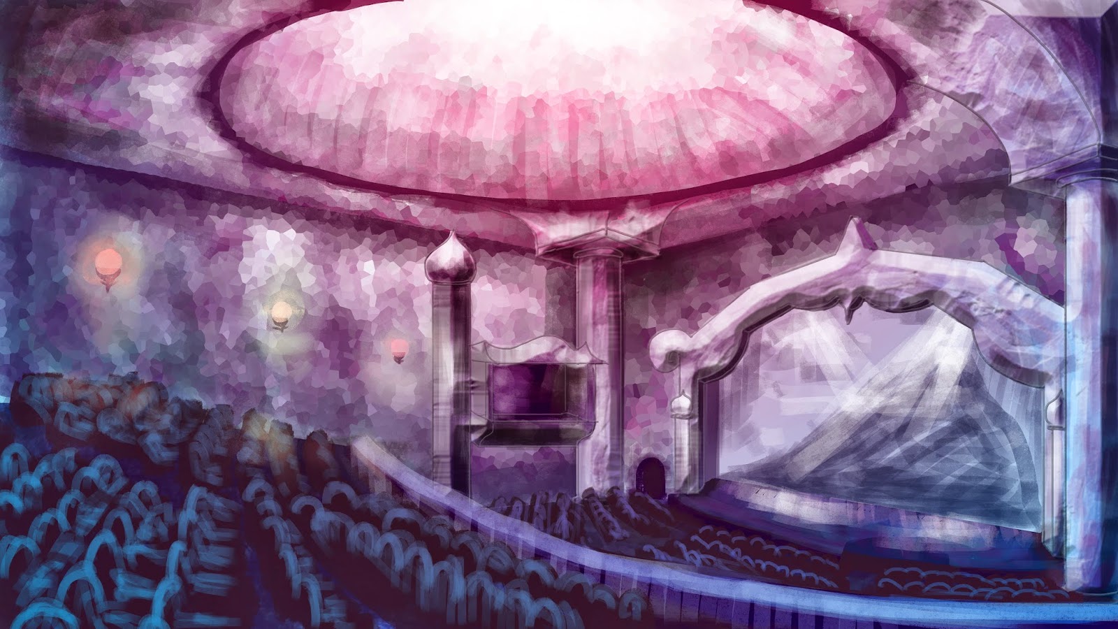
Project: Invisible Cities - Interior Shot Final Piece (colour test)
This will be my final composition for the interior shot, but I am still undecided on the colour scheme to use. I'm slightly swaying more towards colour scheme number one, due to the fact that the exterior has a pink-ish tint to the sky and landscape.
Leave a comment down below and let me know what you guys think. ^.^
Colour Scheme 1:
Colour Scheme 2:


Oh Chelsea, that is sooooo nice!! I love, love, love number 2 but number 1 is still pretty! I would sway towards number 2 as I think it has more depth and is slightly more magical for me. Love it! :)
ReplyDeleteEmma thank you so so much for your input, it really means a lot! :D I'll bear that in mind and see how I feel after I've finished the establishing shot!
DeleteI like both though I also think number 1 :)
ReplyDeleteI think number one Chels, it looks lovely and the pink really matches well with your low angle/establishing shot. When I see them both I can imagine the second picture being the theatre while the lights are up and the audience are filling it and number 2 as the show starts and the lights get dimmer. Love them both, nice job
ReplyDeletePersonally, I think #1 looks best, it looks so calming and beautiful. Both work really great, though!
ReplyDelete