From Script to Screen: Character 1 Design Revised
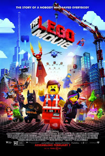
So with Phil's feedback, it has been noted that my character's previous costume was a bit over the top. Phil sent me this image as inspiration:
So I'm hoping I've toned it down enough, but not too much. Let me know what you all think :)


:) She looks much more 'fit for purpose' now! good stuff :)
ReplyDeleteThis comment has been removed by the author.
ReplyDeleteI like the simplicity in your character. Has a very "disney" feel to them. Well done, Chels. :)
ReplyDeleteShe looks much more appropriate now.
ReplyDelete