Posts

Showing posts from October, 2014

Artist Toolkit: Animation and Character - Pixalation

So today in our animation session, we were briefed on our mini project of making a zoetrope animation. We then discussed what we would put into our animation strip and how many frames we needed. Due to the fact that we had extra time towards the end of the session, we then decided to create our own pixilation animation. We were meant to do it next week, but we didn't want to pass up on the opportunity of showing off our Halloween costumes! :)
Project: The "What If" Metropolis - Artist Research: Richard Deacon

And so begins a new project! For this project, at the beginning we were asked to pick a slip of paper out of a magical blue box at random. This slip of paper contains a name, and artist's name, to be specific. But each artist is different. They're not your generic artist, these artists have a variety of backgrounds where they whence came, such as fashion, architecture and photography. The idea is to be experimental! And so, I present to you, my artist! The artist I had selected is Richard Deacon, but somehow Roger Deacon came up somewhere? But that's a different story. This artist is a sculptor, but dabbles in different art areas as well. Richard Deacon Research

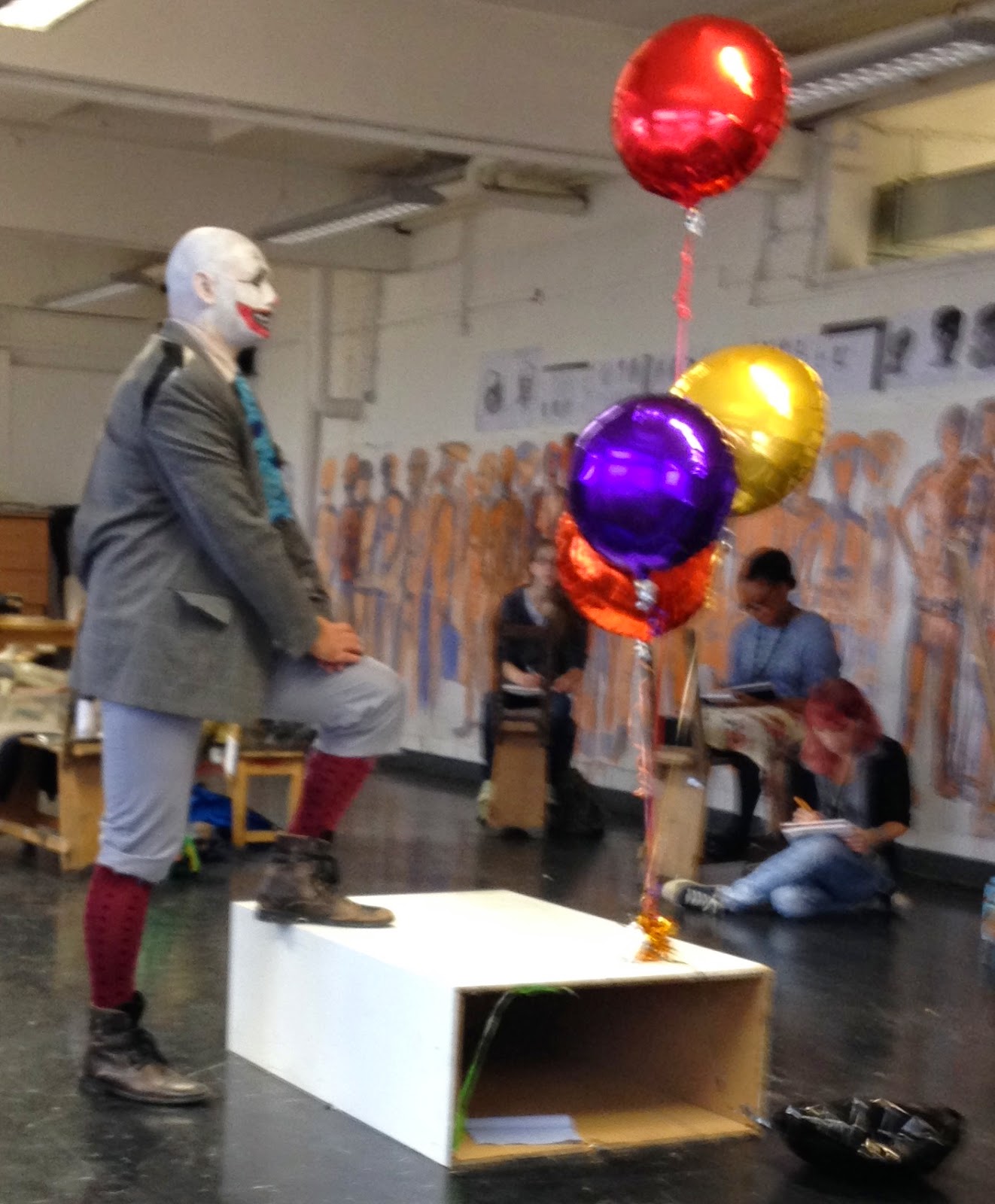
Artist Toolkit: Life Drawing Session - Clowning Around

Image
 So today's life drawing session was definitely an enjoyable one! As a sort of Halloween special, our very own tutor Phil brought in a clown as our model, meet Bubbles everyone!

Film Review - Stanley Kubrick’s “2001: A Space Odyssey” (1968)

Image
Figure 1. 2001: A Space Odyssey Movie Poster There is somewhat little to say, and yet a lot to be said about Stanley Kubrick’s “2001: A Space Odyssey” (1968). It is a spectacle to behold once viewing it. This breathtaking depiction of the endless netherworld that is space is truly one to leave you in a state of awe. It is a journey that one must experience at some point. The majority of the film is in deafening silence, dialogue-wise, which is an accurate representation of what it means to travel within space. As Renata Adler had said, “But all this is the weakest side of a very complicated, languid movie—in which almost a half-hour passes before the first man appears and the first word is spoken, and an entire hour goes by before the plot even begins to declare itself.” (Adler, 1968). The journey begins with a barren desert like plane, inhabited by apes. The main event occurring in this prolonged scene is that of an ape discovering the power of beating with a bone “weap...

Maya: Texturing Part 1 - Common Shaders

Image
Well, it's been a while since I posted a Maya tutorial, but here we have it! My attempt at the texturing tutorial! In this tutorial, I learnt how to create and apply different textures to a model. Above are what I created and applied.

Project: Invisible Cities - Submission Disk CD Case Cover

Image

Artist Toolkit: Life Drawing Session - Balloons

Image
So Wednesday's life drawing session involved this whacky balloon sculpture installation, and as life drawing goes, we drew it! I really enjoy life drawing and it felt really liberating to just be more relaxed with my mark making. Life drawing was about being experimental and really considering space and structure. It really helped me to understand negative space and scale, so you can probably tell that I'm pretty excited for next week's session! :)

Project: Invisible Cities - Final Critique Presentation

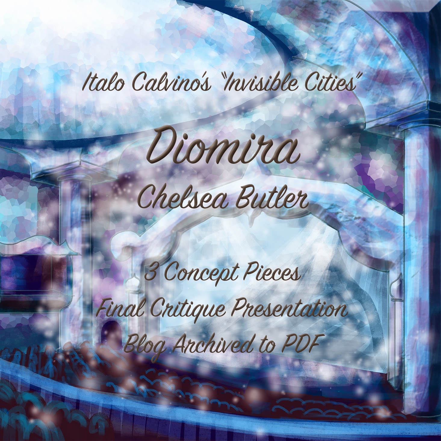
Final Critique Presentation

Project: Invisible Cities - Research Presentation

Invisible Cities Project Research

Project: Invisible Cities - Exterior Establishing Shot Final Piece

Image

Project: Invisible Cities - Interior Shot Final Piece (colour test)

Image
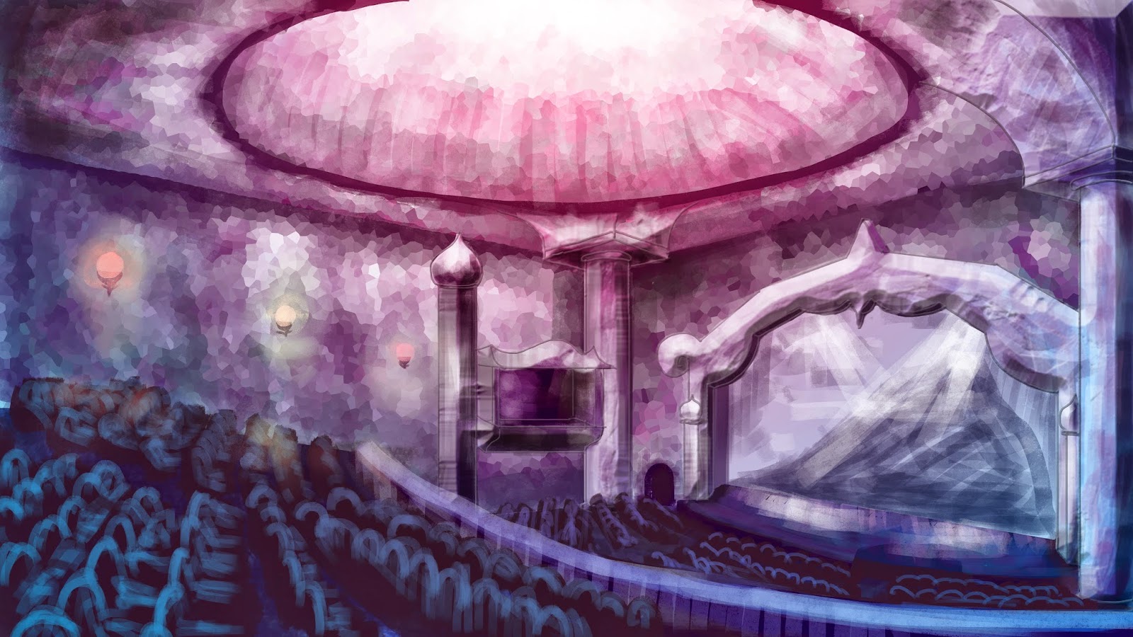
This will be my final composition for the interior shot, but I am still undecided on the colour scheme to use. I'm slightly swaying more towards colour scheme number one, due to the fact that the exterior has a pink-ish tint to the sky and landscape.  Leave a comment down below and let me know what you guys think. ^.^ Colour Scheme 1: Colour Scheme 2:

Project: Invisible Cities - Low Angle Shot Final Piece UPDATED

Image

Project: Invisible Cities - Low Angle Shot Final Piece

Image

Project: Invisible Cities - Dome Practise

Image
I thought my domes were looking a bit plain so I thought I'd spruce them up a bit with some metal railing designs added on top. I took most of my inspiration from The Eden Project. I researched into it and sometimes they tend to light the domes from the inside at night. As part of the city description, it says that they light coloured lamps at night, so I though I'd add the domes into the mixture, as a way of making them more interesting.

Project: Invisible Cities - Low Angle Thumbnail Practise

Image
Just a quick practise of some low angle shots that I could develop. I took one of my very first thumbnail ideas and added colour as I liked the way I composed the image (see thumbnail 3). As these are quick sketches I've been pretty simple with the brush marks I have made.

Project: Invisible Cities - Layout Trial

Image
Here's just a quick attempt at laying out how I could possibly go about my exterior low angle shot. Just a rough copy but the idea's still there! The shot here is a depiction of what the entrance to the crystal theatre could look like, where a set of gates lead to this grand piece of architecture, and the pathway aligned with bronze statues of the gods. I will vary how the gods look in the final piece but I wanted to establish how the shot would look. I'm not too sure about the composition, so I may just go back to thumb nailing the layouts.

Project: Invisible Cities - Concept Artist - "Who's Who?"

Concept Artist - "Who's Who?"

Project: Invisible Cities - Exterior Establishing Shot Practise

Image
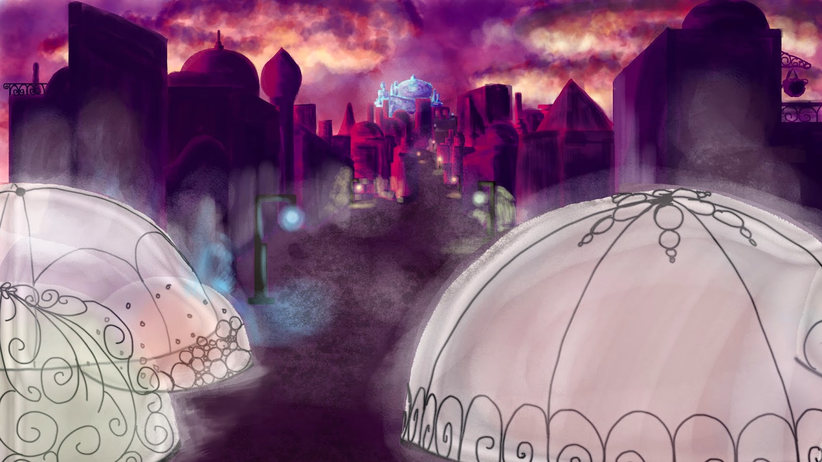
Just a quick practise to see how I want to lay out my exterior establishing shot final piece. As you can see, I went for two completely different, extreme camera angles. Idea 1 is a true bird's eye view of the city itself, and it gives us a feel of the wide expanse of the city and how large it can be. I thought that a slanted shot would create a more dynamic view of the city as I didn't want the shot to be too stiff. You know, just getting the whole "expressive" theme in there. The only thing I would say that I want to redo is the cloud at the front. I MADE IT TOO OPAQUE! D: I'd make the cloud more transparent so you can see the full city. Idea 2 is at a low level angle. I guess you could say it's at human eye level, looking up at the magnificence of the city, as I want to portray this grand sort of experience when an individual visits. As these are rough copies, I wasn't too fussed with detail at the time, but obviously I'd consider sha...

Autodesk Maya - Alleyway Scene

Image

Project: Invisible Cities - Crystal Theatre Development

Image
Ok so here we have some more ideas by yours truly, this time, it being about the crystal theatre mentioned within the text extract of Diomira (see image below) Bearing in mind that these are rough sketches, I just wanted to quickly get my ideas down before they disappear! My initial thought was to make the theatre somewhat abstract and "expressive" by including the jagged crystal forms within the design, but I also want to include the polished and spiritual aesthetic of temples to then create what I consider to be the "centre piece" of my city. I want this piece of architecture to be grand and bold, so when it said that there was a crystal theatre, I took it as literally being made of crystals, hence why I chose the colour scheme of pinks, blues and purples. While sketch 1 has a more asymmetrical approach to this grand design, sketch 2 appears to be more balanced and palace-like. I've also included a few rough sketches of how the interior could look...

Project: Invisible Cities - Possible City Layout Ideas

Image
So here I have some city layouts that I could potentially use, but am not too sure what would be best suited to my city of Diomira (see description below). City Layout 1: This city will be on a somewhat flat terrain and encased by the 60 silver domes. The city will have the crystal theatre as the central piece and buildings will splay out from the centre in a sun ray sort of fashion. City Layout 2: This idea involves the entire city being set upon a small mountain, with stairs and hilly walkways scattered between the buildings and houses. At the peak of the mountain will be the crystal theatre and the bronze statues of gods circling around it. The silver domes will surround the perimeter of the bottom of the mountain, like a tower of profiteroles. So there you have it guys, those are my ideas so far. Both ideas take a slightly different approach to the city. I feel that city layout 2 takes a more rural village approach, whereas city layout 1 makes it feel like a bu...

Practising Perspective

Image
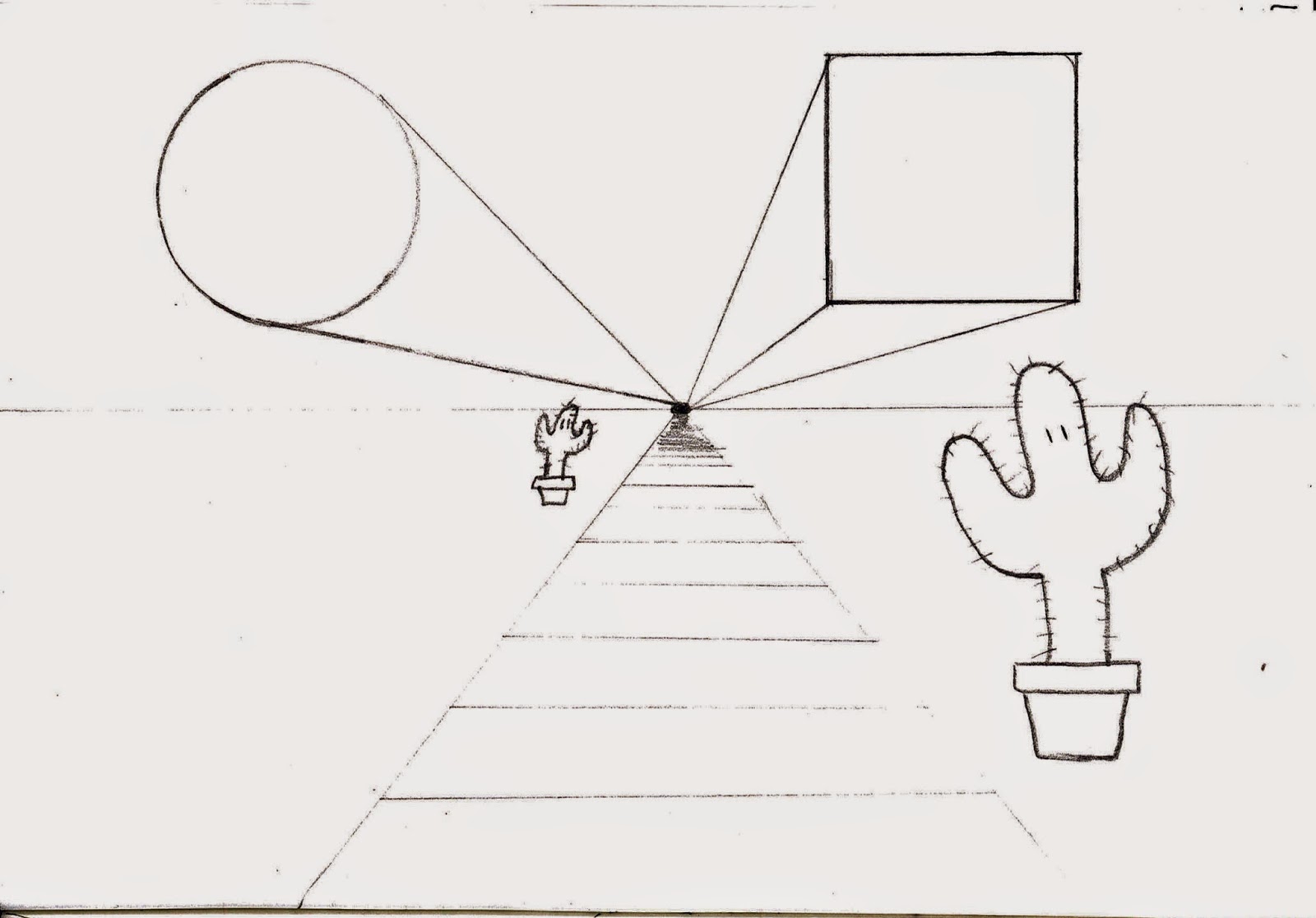
Here's just a quick few sketches of some perspective exercises I've been practising. I'm learning the basics so that I may get a better understanding of perspective before I move on to taking on a more complex task. I will be using this as reference when designing my city.  1 Point Perspective: 2 Point Perspective: 3 Point Perspective: